Year:1970 | Project: Simon de Wit supermarket identity
Simon De Wit, one of the largest supermarket chains in the Netherlands at the time, approached me in 1970 to develop an integral corporate identity. The reason for this was ambitious plans to expand the number of stores. As a 29 year old it presented an exciting challenge.
To kick off the project, I visited several Simon De Wit supermarkets, as well as those of competitors. My observations revealed a uniformity in product presentation in these stores, with limited variation in interior design. Furthermore, the atmosphere was cold and impersonal, made worse by an abundance of fluorescent lighting.
That is why I made a thorough analysis of the company’s brand elements and formulated a detailed set of requirements. This included the design of a distinctive supermarket-themed font, the creation of a logo, the development of an interior improvement strategy and the design of additional brand collateral.
The font
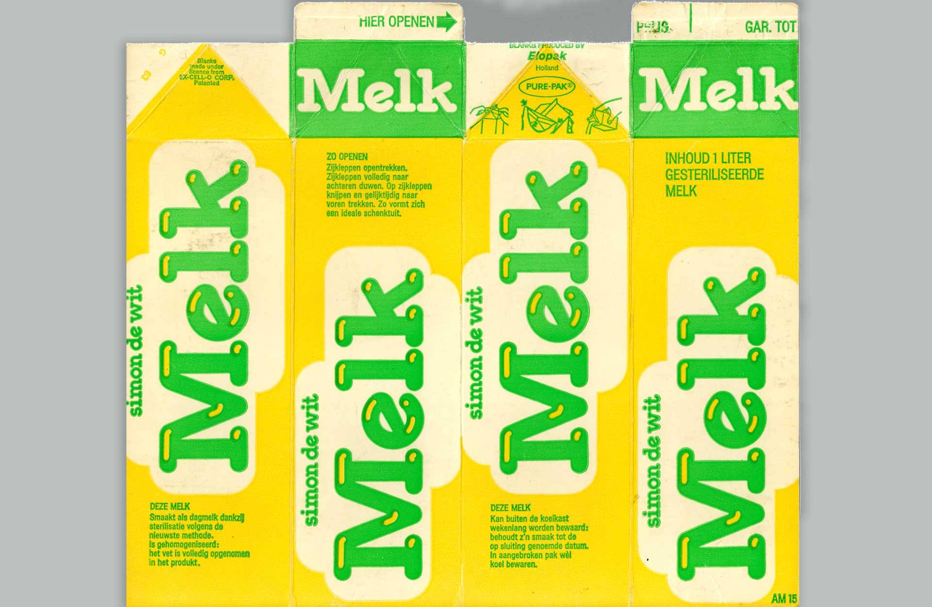
Since at that time supermarkets mainly communicated with text in all media, I started designing a “supermarket-like” font. During my training at the Royal College of Art in London, I had learned to think from a concept as much as possible and to implement it from there. A bit like throwing a stone into a pond and creating a circle of waves. With this newly designed font, I thought I would distill a formal language that could be applied to all kinds of company expressions at a later stage.
The logo
The Simon de Wit logo with an image of Simon, the supermakt mascot, in the middle.
The interior
My design team and I have developed everything for the interior with one main goal: create a warm atmosphere. For this we used warm colors and the T.L. lamps shortened and a yellow slatted ceiling installed underneath
so that the light had a ‘cozy’ appearance. Here and there, according to strict rules, form elements that were related were applied to the font.
Packaging
A number of shape elements were developed from the typeface that could be endlessly applied to the packaging of the products, for the interior and all kinds of other applications.